Typography, the art of arranging type, is a fundamental aspect of graphic design that transcends beyond the realm of just simple textual content. In this article, we will explore the impact of typography on design, dissect the elements of type, and discuss strategies for selecting the perfect font combinations for your next project.
Typography in Graphic Design is more than choosing attractive fonts. It influences branding, digital marketing performance, user engagement, and accessibility across global audiences. As design becomes increasingly digital-first, typography now plays a strategic role in SEO, UX design, and brand identity systems.
Table of Contents
Anatomy of Typography in Graphic Design
Why Typography in Graphic Design Matters Globally
Typography affects industries including advertising, publishing, UI/UX, branding, and digital marketing worldwide.
Global Design Industry Influence Table
| Sector | Impact Level of Typography | Primary Goal |
| Digital Marketing | Very High | Engagement & CTR |
| Web Design | Very High | Readability & UX |
| Branding | High | Identity & Trust |
| Publishing | High | Legibility |
| Advertising | Medium–High | Visual Attention |
The Importance of Typography in Graphic Design
Selecting striking images and keeping an organized layout are just a few of the many tasks a graphic designer is responsible for tackling. Typographic design speaks to the message and tone. Good typographic design can create a hierarchy, structure information, improve the readability and legibility of text, improve the experience, and build the identity of the organization.
Global Typography Usage Trends (Data Table)
Font Style Popularity by Region
| Region | Most Used Font Type | Secondary |
| USA | Sans Serif | Serif |
| UK | Serif | Sans Serif |
| India | Sans Serif | Display |
| Germany | Sans Serif | Slab Serif |
| Japan | Sans Serif | Script |
Insight: Digital-first economies prefer clean sans-serif typography for screen readability.
Types of Fonts
In order to travel through the typographic world, there are some elements that must be understood. Serifs are fonts in which small lines are attached to the end of a stroke. Because of their traditional look, they are great for print and formal uses. Sans Serifs are fonts that do not have serifs and are defined by their clean, simple lines. These are great for digital design, and are also considered to be more modern and minimalist.
Slab Serifs have thicker, block-like serifs that can give an impression of strength and boldness. Script typefaces are inspired by handwriting, and, therefore, are used very sparingly in places like headings of winter wedding invitations. Display fonts are intended for use at large sizes and are best used in headers, logos, or titles.
Font Category Usage by Industry
Industry vs Font Preference
| Industry | Primary Font Type | Reason |
| Law Firms | Serif | Authority |
| Tech Startups | Sans Serif | Modern Look |
| Fashion | Script/Display | Style Appeal |
| News Media | Serif | Long-form readability |
| E-commerce | Sans Serif | Mobile optimization |
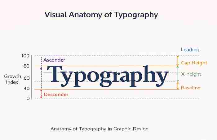
Elements of Typography
To level up your typographic game, familiarize yourself with the following elements:
- Typeface and Fonts: A typeface is a collection of characters with the same design, while a font is a specific style and weight of a typeface.
- Contrast: Using varying type sizes, styles, and weights can create visual interest and help call attention to important elements.
- Leading, Kerning, and Tracking: Leading is the vertical space between lines of text, kerning refers to the space between individual letter pairs, and tracking is the overall spacing between characters in a block of text.
- Alignment: The arrangement of text relative to the margins – left, right, center, or justified.
Core Typography Design Elements Explained
Typography Element Impact Table
| Element | Why It Matters | SEO/UX Impact |
| Hierarchy | Guides readers | Reduces bounce rate |
| Leading | Improves readability | Enhances UX |
| Kerning | Professional polish | Visual trust |
| Contrast | Highlights key info | Better engagement |
| Alignment | Layout clarity | Mobile optimization |
Finding the Perfect Font Combinations
When combining fonts, consider the following techniques:
Contrast and Balance. When combining fonts, contrast is as important as harmony. A design where a bold sans serif and a light script are used is very interesting and dynamic. Limit your choice of fonts to 2 or 3. Using a large number of fonts creates chaos. To achieve a harmonious design, stick to different weights and styles in the same typeface family.
Typography Software & Tool Costs in Top 5 Countries
Typography Tools Pricing Comparison
| Country | Popular App | Monthly Cost | Where to Buy Online |
| USA | Adobe Creative Cloud | $20–$55 | adobe.com |
| UK | Canva Pro | £10–£15 | canva.com |
| India | Adobe CC | ₹1,675–₹4,200 | adobe.com/in |
| Germany | Affinity Designer | €70 (one-time) | affinity.serif.com |
| Australia | Canva Pro | AUD 17 | canva.com |
Resource:
For font best practices and accessibility guidance, refer to:
https://www.w3.org/WAI/
Color and Typography
It is common for designers to overlook the detail of color and typography. Color can influence feelings and emotions, highlight specific elements of your design and support your branding. When choosing colors for text, make sure it is legible and also visually appealing. Ensure that your design has colors that maintain a high contrast ratio. Be also aware of color psychology and pick colors that best reflect the message and tone of your brand.
Responsive Typography
Typography must not only be legible, but also visually appealing at different screen sizes and on multiple devices. Responsive typography allows for the design to ensure optimal legibility of the text, regardless of the screen size. Using scalable units that adjust according to the size of the screen, or changing the design according to specific size breakpoints, are methods to achieve this goal.
Responsive Typography Benchmarks
Device Font Size Benchmarks
| Device | Recommended Body Size | Line Length |
| Desktop | 16–18px | 50–75 characters |
| Tablet | 15–17px | 45–65 characters |
| Mobile | 14–16px | 35–45 characters |
Typography Accessibility
Making sure your typography is accessible to a wide range of audiences, including those with visual disabilities or impairments, is vital to creating truly inclusive designs. Consider font size, line length, ample whitespace, and appropriate font choices to improve readability for all users. Additionally, review your design in a variety of color modes, such as grayscale or inverted colors, to guarantee legibility for colorblind individuals.
Accessibility Compliance Standards
Accessibility Requirements Table
| Standard | Requirement |
| WCAG AA | 4.5:1 contrast ratio |
| WCAG AAA | 7:1 contrast ratio |
| Line Spacing | 1.5x minimum |
| Paragraph Spacing | 2x line height |
| Avoid | Overly decorative fonts |
Tying It Back to Your Brand
When designing materials for a brand, the selected type must be in line with the brand’s look and message as a whole. Think of a fun display type that is appropriate for a kid’s brand but would not work for a law firm as it would undermine their professionalism.
Mastering the craft of typography in graphic design is not just about knowing how to do it, but also about its significance, its components, and the ways of selecting and combining type that express the intended message. As you continue along the design path, never lose sight of the fact that pleasing type is always the bedrock of effective design.
SEO and Typography in Graphic Design
Typography impacts SEO indirectly by improving engagement signals.
Key SEO-Related Typography Tips
- Use proper H1–H6 hierarchy
- Avoid text embedded in images
- Maintain consistent font loading speed
- Optimize for mobile-first indexing
- Use web-safe or optimized font files
Pro Tip:
Typography in Graphic Design is aesthetics and also a facet of information design. With good typography, you decrease the degree of mental effort and increase trust, and in digital spaces, you improve the likelihood of a desired action.
Conclusion
Typography in Graphic Design has shifted from an emphasis on print to a highly planned digital focus, affecting various aspects of branding, inclusivity, search engine optimization, and user interaction in every corner of the world. The combination of beauty and functionality is reserved for designers who possess an understanding of hierarchy, responsiveness, and inclusivity.